> For the complete documentation index, see [llms.txt](https://docs.toomuchmedia.com/llms.txt). Markdown versions of documentation pages are available by appending `.md` to page URLs; this page is available as [Markdown](https://docs.toomuchmedia.com/content-management/member-areas-and-tours/themes/block-types.md).

# Block Types

*Article Topics:* [*Blocks*](/getting-started/common-topics/blocks.md)

## The Block Library

Now that we have discussed Block Types, let's talk about where your blocks are located. Your entire collection of Blocks is saved in your Block Library, which can be accessed when you want to add a new block to your page. When a Base Block is added and edited on your Page, it is automatically added to your Block Library. Any changes made to your Block will update the settings in your Library.\
\
This means that changes to a block on your Home page will affect any other page that uses the same block. This feature saves a tremendous amount of time, as you only need to edit a block once and the changes will be reflected throughout your site.

***

## Types of Blocks

The Block Builder offers a variety of blocks that can be accessed through the Block Manager to serve different content needs. Each block type comes with its own customization options, allowing you to tailor the appearance and functionality to fit your site's specific needs.&#x20;

Here is a list of some default Blocks, known as Base Blocks, which are provided with your NATS installation:&#x20;

<table data-view="cards" data-full-width="false"><thead><tr><th></th><th></th><th data-hidden></th><th data-hidden data-type="checkbox"></th><th data-hidden data-card-cover data-type="files"></th><th data-hidden data-card-target data-type="content-ref"></th></tr></thead><tbody><tr><td><strong>Set View Block</strong></td><td>Provides a view of a Content Set.</td><td></td><td>false</td><td></td><td><a href="/content-management/member-areas-and-tours/themes/block-types/set-view-block.md">Set View Block</a></td></tr><tr><td><strong>Set List Block</strong></td><td>Provides a list of photo or video galleries with filtering options.</td><td></td><td>false</td><td></td><td><a href="/content-management/member-areas-and-tours/themes/block-types/set-list-block.md">Set List Block</a></td></tr><tr><td><strong>Model View Block</strong></td><td>Provides a view of model details.</td><td></td><td>false</td><td></td><td><a href="/content-management/member-areas-and-tours/themes/block-types/model-view-block.md">Model View Block</a></td></tr><tr><td><strong>Model List Block</strong></td><td> Provides a list of models with filtering options. </td><td></td><td>false</td><td></td><td><a href="/content-management/member-areas-and-tours/themes/block-types/model-list-block.md">Model List Block</a></td></tr><tr><td><strong>HTML Block</strong></td><td>This is for using custom HTML to display. </td><td></td><td>false</td><td></td><td><a href="/content-management/member-areas-and-tours/themes/block-types/html-block.md">HTML Block</a></td></tr><tr><td><strong>Navigation Bar Block</strong></td><td>Provides a navigation bar with logo &#x26; responsive functionality. </td><td></td><td>false</td><td></td><td><a href="/content-management/member-areas-and-tours/themes/block-types/navigation-bar-block.md">Navigation Bar Block</a></td></tr><tr><td><strong>Carousel Block</strong></td><td>To add a custom carousel to display 1 or more images.</td><td></td><td>false</td><td></td><td><a href="/content-management/member-areas-and-tours/themes/block-types/carousel-block.md">Carousel Block</a></td></tr><tr><td><strong>Metadata List Block</strong></td><td>Lists elements of specified metadata. </td><td></td><td>false</td><td></td><td><a href="/content-management/member-areas-and-tours/themes/block-types/metadata-list-block.md">Metadata List Block</a></td></tr><tr><td><strong>Comment Block</strong></td><td>To add a comment section to your page. </td><td></td><td>false</td><td></td><td><a href="/content-management/member-areas-and-tours/themes/block-types/comment-block.md">Comment Block</a></td></tr><tr><td><strong>Navigation List Block</strong></td><td>Horizontal and Vertical Navigation lists.</td><td></td><td>false</td><td></td><td><a href="/content-management/member-areas-and-tours/themes/block-types/navigation-list-block.md">Navigation List Block</a></td></tr><tr><td><strong>Text Search Block</strong></td><td>Text search block.</td><td></td><td>false</td><td></td><td><a href="/content-management/member-areas-and-tours/themes/block-types/text-search-block.md">Text Search Block</a></td></tr><tr><td><strong>Member Account Block</strong></td><td>Displays information of the logged in Member.</td><td></td><td>false</td><td></td><td><a href="/content-management/member-areas-and-tours/themes/block-types/member-account-block.md">Member Account Block</a></td></tr><tr><td><strong>Media Block</strong></td><td>A custom Media to display.</td><td></td><td>false</td><td></td><td><a href="/content-management/member-areas-and-tours/themes/block-types/media-block.md">Media Block</a></td></tr><tr><td><strong>Link Block</strong></td><td>Inserts a link onto the page.</td><td></td><td>false</td><td></td><td><a href="/content-management/member-areas-and-tours/themes/block-types/link-block.md">Link Block</a></td></tr><tr><td><strong>Login Form Block</strong></td><td>Displays the login form.</td><td></td><td>false</td><td></td><td><a href="/content-management/member-areas-and-tours/themes/block-types/login-form-block.md">Login Form Block</a></td></tr></tbody></table>

## Common Block Settings

Blocks contain multiple settings that help you control:

* The overall design
* What details are displayed to your users
* What happens when users click on different parts of that block

Though each block may contain settings unique to that specific block type, there are many settings shared across all Block Types. You can find a list of these settings and their functions below.&#x20;

### Design: Block Design and Block Content

Available On: All Block Types

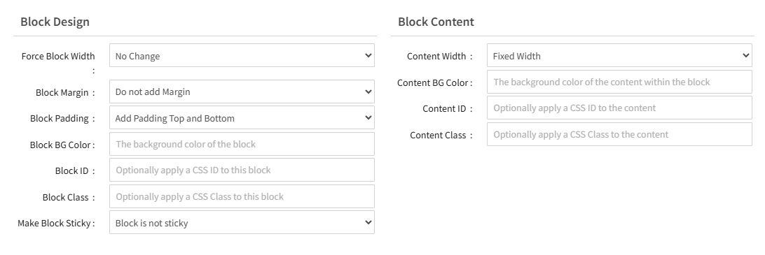
On every lock, you'll find Block Design and Block Content sections that contain settings that control both the area around a block and the look of the content within the block. These settings allow you to modify Padding, Margins, Width, and colors. Additionally, you can insert custom CSS Classes and IDs that have been defined in the theme's Custom CSS field.&#x20;

You'll find these settings in the Design tab of any block.&#x20;

<figure><img src="https://2232071635-files.gitbook.io/~/files/v0/b/gitbook-x-prod.appspot.com/o/spaces%2FWJVne6meHqGT8rzsBdod%2Fuploads%2FQhDAFZq9kLYEDZBdafPs%2Fimage.png?alt=media&amp;token=d96dcb00-bb77-481b-bd35-5834bd7d9052" alt=""><figcaption></figcaption></figure>

### Interactive Sorting

Available On: Set List, Model List

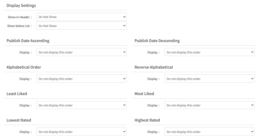
Interactive Sorting allows you to give sorting options to your users so they can sort through a list of content by publishing date, most liked, highest rated, and more.&#x20;

<figure><img src="https://2232071635-files.gitbook.io/~/files/v0/b/gitbook-x-prod.appspot.com/o/spaces%2FWJVne6meHqGT8rzsBdod%2Fuploads%2FonEyyUSt5M2QNmqiALfx%2Fimage.png?alt=media&amp;token=1e7fac4b-814c-47fe-bd81-bd612b2c5c57" alt=""><figcaption></figcaption></figure>

### Click Destination

Available On: Set List, Model List, Metadata List

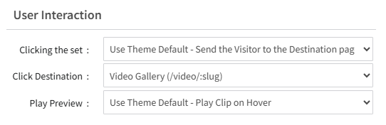
On Blocks responsible for displaying a list of content, you'll find the User Interaction section, which contains settings to set the behavior of a click. You can set the destination the user is sent to, whether that is the Join Page or a page within your theme that you can specify, like the Model View or Set View page.&#x20;

<figure><img src="https://2232071635-files.gitbook.io/~/files/v0/b/gitbook-x-prod.appspot.com/o/spaces%2FWJVne6meHqGT8rzsBdod%2Fuploads%2FPGyBp4nPnkAhkfMHbhPI%2Fimage.png?alt=media&amp;token=cbefe510-58dc-4d3b-9562-0a1d62e06d45" alt=""><figcaption></figcaption></figure>

### View More Links

Available On: Set List, Model List&#x20;

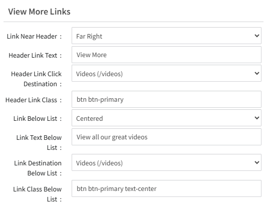
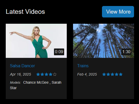
View More Links are links that appear either above or below a block, providing another navigation option for users to see a full list of content relevant to the block the link appears on.&#x20;

The link can be placed above or below the block while being aligned to the left, right, or center. The click destination can be configured, and the link itself can be modified using CSS classes.

<div align="center"><figure><img src="https://2232071635-files.gitbook.io/~/files/v0/b/gitbook-x-prod.appspot.com/o/spaces%2FWJVne6meHqGT8rzsBdod%2Fuploads%2FtP7tcXhVpgOl21JTC3T2%2Fimage.png?alt=media&amp;token=16ccff76-5998-44b9-989c-d761976b2566" alt=""><figcaption></figcaption></figure> <figure><img src="https://2232071635-files.gitbook.io/~/files/v0/b/gitbook-x-prod.appspot.com/o/spaces%2FWJVne6meHqGT8rzsBdod%2Fuploads%2FI6cwzJlvBdqcIodnhOt0%2Fcms-commonblocksettings-viewmore.png?alt=media&amp;token=a080c913-d6f9-4027-9e00-094285e406fc" alt=""><figcaption></figcaption></figure></div>

## Related Articles

{% content-ref url="/pages/7lUwaSI9yImefB8h0Fa6" %}
[Using the Page Builder](/content-management/member-areas-and-tours/customizing-your-theme/using-the-page-builder.md)
{% endcontent-ref %}